Sunday, January 29, 2017

Night Fishing: Analogous colours & Impressionist technique

NightFishing-BMFineart
This is an analogous painting exercise for my Impressionist painting class. Working from a black and white photo,  the aim is to work with a limited palette of analogous colours and create the gradations of light to dark.  The logic behind the palette is to choose the darkest colour and the lightest colour using colours that are in the same family.  In this case I was using ultramarine blue, phthalo blue and phthalo green.  The sttongest highlight was a cadmium yellow for the moon and water reflections.
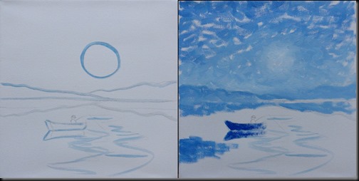
The images below show the progression of the painting.  This first stage of the painting was created with just ultramarine blue.  When the paint was dry, I mixed a palette of analogous colours (see on the bottom).
001-2
The drawing is kept very simple.  Small individual brush strokes are used to loosely indicate the major shapes of light and dark.
003-4
I continue to build up the surface with the different tones of ultramarine blue.  I let the paint dry and then go on to recover the surface with the analogous colours.
005-6
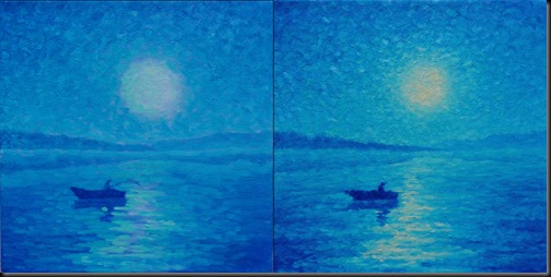
I start with the sky, using the phthalo green mix for the moon and then progressively lay in the the relatively darker colours in the sky then in the water.
007-8
Once the whole surface is equally covered with the blues and blue greens, I finally add the pale cadmium yellow in the moon and water. 

Analogous colour palette:

palette
Here is a close-up of the surface showing the individual brush strokes and the texture created by superimposing the paint:
closeup

Tuesday, October 11, 2016

Oil Pastel Study with Holbein Oil Pastels

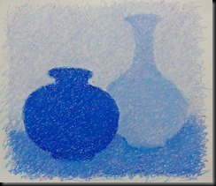
This is an oil pastel exercise that is useful way to explore how colours can be mixed by layering. Rather than use blending tools, the point is to use hatched lines.The lines are spaced apart to allow for the colours to show through.  This also leave the surface area open so that I can continue to add more layers of colour.  The effect is both a physical mix and an optical mix of colours.

I am using two analogous colours that should mix to create a colour that is found in between them.  In this case I used cobalt blue and red violet  with the expected result to be a blue violet.  I wanted the final image to have a coherent colour.  In other words, the different areas should achieve the same colour  so that the final composition looks like a monochrome. Here are the steps that I took to do the demo drawing using three tone of cobalt blue,  red violet  and white.

For each layer of colour, I alternated between doing a red violet layer, then a blue layer.

A key element when doing oil pastel is to always work from lighter to darker and to use a medium to light pressure.  As you can see from the steps above, the composition gets progressively darker as more layers of colour are added.

I hope the oil pastel enthusiasts out there will find this useful.
01
Initial layer of red violet
03
Cobalt blue layer
05
Notice that I am establishing the tones.
DSC06382
Close-up showing different colours and tones
06 08
09
DSC06390
Final closeup.  The blues and violets are more obvious here.


Friday, August 5, 2016

Les Demoiselles Rousseau

20 x 30 inches,oil/canvas
Finally finished and delivered, this is a family portrait if the three Rousseau sisters, daughters of Mr. M Rousseau.  I composed it from three separate and very different photos.  Two of which were selfies, so it qualifies for my Contact Portrait  series of paintings.  The clouds and balloon play on the profession of their dad.  It was quite a challenging portrait, to say the least!