Tuesday, October 11, 2016

Oil Pastel Study with Holbein Oil Pastels

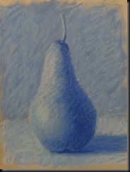
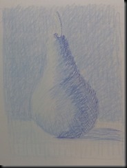
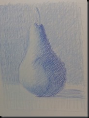
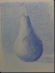
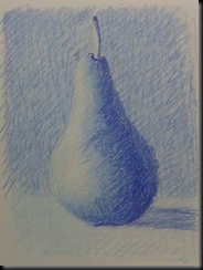
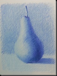
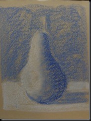
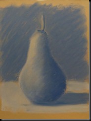
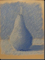
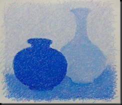
This is an oil pastel exercise that is useful way to explore how colours can be mixed by layering. Rather than use blending tools, the point is to use hatched lines.The lines are spaced apart to allow for the colours to show through.  This also leave the surface area open so that I can continue to add more layers of colour.  The effect is both a physical mix and an optical mix of colours.

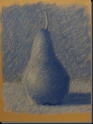
I am using two analogous colours that should mix to create a colour that is found in between them.  In this case I used cobalt blue and red violet  with the expected result to be a blue violet.  I wanted the final image to have a coherent colour.  In other words, the different areas should achieve the same colour  so that the final composition looks like a monochrome. Here are the steps that I took to do the demo drawing using three tone of cobalt blue,  red violet  and white.

For each layer of colour, I alternated between doing a red violet layer, then a blue layer.

A key element when doing oil pastel is to always work from lighter to darker and to use a medium to light pressure.  As you can see from the steps above, the composition gets progressively darker as more layers of colour are added.

I hope the oil pastel enthusiasts out there will find this useful.
01
Initial layer of red violet
03
Cobalt blue layer
05
Notice that I am establishing the tones.
DSC06382
Close-up showing different colours and tones
06 08
09
DSC06390
Final closeup.  The blues and violets are more obvious here.


Friday, August 5, 2016

Les Demoiselles Rousseau

20 x 30 inches,oil/canvas
Finally finished and delivered, this is a family portrait if the three Rousseau sisters, daughters of Mr. M Rousseau.  I composed it from three separate and very different photos.  Two of which were selfies, so it qualifies for my Contact Portrait  series of paintings.  The clouds and balloon play on the profession of their dad.  It was quite a challenging portrait, to say the least!

Monday, June 13, 2016

Impressionist Landscape in Oil Part 2

12 x 16 inches, oil/canvas
Here is part 2 of the Impressionist Landscape painting done in oil.  It is a small landscape study done with my Impressionist class at the Visual Arts Centre in Montreal.  The focus was on achieving the different planes of the landscape, background, middle ground and foreground, using loose brush strokes without getting caught up with too much detail and looking at how cool and warm colours can create luminous lights and shadows.


Sunday, May 29, 2016

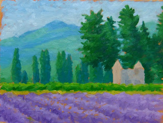
Impressionist Landscape Video: Lavender Fields in Oil

oil/canvas  11 x 14 inches


Yes, another video from one of my classes.  I can't help it.  When I have a bit of spare time, I really love making these things. Perhaps one day I will do a real movie...when I can afford to get a movie camera. Maybe some crowd funding...or not.

This is a short demo based on a painting exercise in my Impressionist class at the VAC.  The aim is paint in a loose style.  The focus is not on details but on the large shapes and how they are created with colour and tone.  In Part 2 (coming soon), I will add a second layer of colour that will focus on the warm and cool colours to accentuate the feeling of sunlight.

Here are a few of the stages:


And here is the video.  You can also see it on YouTube.


P.S. I often have trouble spelling lavender, probably because of French (lavande). 

Thursday, May 19, 2016

Rose

14 x 18 inches, oil/canvas
It is my Mom's 80th birthday this month!  This rose is for her.  It is  from the beautiful garden that my father kept when he was still alive.  Their garden was a wonderful haven for me that I would look forward to when I would go home in the summer. 

Sunday, May 8, 2016

Impressionist Landscape in Acrylic


We were working on a landscape in my Impressionist class this week that focused on a limited palette of analogous colours.  It  is one of my favorite painting exercises to show how a limited palette can be used to create a luminous composition.  It is also a great example of how little detail is needed when the focus is placed on colour.
I made a video showing the process.  Here are some of the images from the video:
Roman Cupolas-01 Roman Cupolas-02 Roman Cupolas-03
Here is the video.  You can also see it on my YouTube channel.


Thursday, March 31, 2016

Painting Class at the VAC

I'll be teaching an Impressionist technique class at the Visual Arts Centre for the spring session.  It's one of my favorite classes.  Classes start on April 18th.  Registration has already started!

If you want to know more, contact me or the Visual Arts Centre.  info@centredesartsvisuels.ca.

I am also teaching:
  • Oil pastel techniques will be on Thursdays from 1 - 4 pm.  Oil Pastel is a great medium that brings together painting and drawing

Monday, February 15, 2016

Coloured Pencil–Red Pepper


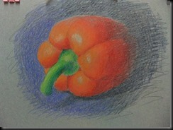
Here are a few photos showing a coloured pencil drawing of a red pepper.  As I showed in the last post. I start with a tonal scale to work out how to get a gradation from light to dark.  In this particular case, the scale from light to dark is not just one colour but several colours that range from pale yellow to orange to orange red to different tones of red for the pepper.  This is not just a tonal gradation but also a colour gradation following the colour wheel.
pepper-00

I chose to work on grey paper because of the dark background of the composition and I also wanted to experiment with the use of lighter colours on a darker ground.  The coloured pencil process is one which starts with relatively light tones working towards darker tones.  Many layers of colour are added progressively on top of each other.

pepper-02 The basic shape of the composition is drawn in and the lighter colours are added using very light pressure.

pepper-03 I continue to add the lighter tones of colour on the pepper, stem and background.

I use light pressure and I am weaving one colour into another to create a smooth transition.

pepper-04 I have focused on the lighter tones of the pepper using the oranges and red orange colours. Once enough of these colours are applied  and the background colours are added, I can start to slowly darken the shadows of the pepper.

pepper-06 This is the finished study.  The darkest colours were added during the last half of the drawing process. Colours are constantly layered one over the other to get smooth transitions.

Working is layers is a slow process that demands much patience.  The pay off is that layering dark over light creates a more dense and rich depth of colour.

Sunday, February 14, 2016

Drawing with Colour


I introduced colour into my drawing class last week. We worked with coloured pencils and soft pastel. In my opinion, it is easiest to start colour in monochromes. I asked everyone to bring a couple of tones of one colour plus white and black. Here are a couple of demos, one in coloured pencil and one in soft pastel.
cp10 sp-12
coloured pencil soft pastel

Here is a short demo explaining each process. When starting with a new material, I like to begin with a simple tonal scale. It allows me to understand how to create gradations and transitions from one tone to the next.

Coloured Pencil:
For the coloured pencils, I worked with three tones of blue, a pale, medium and very dark tone as well as white.  The drawing is done on smooth bristol.  Here is the tonal scale.
cp-00

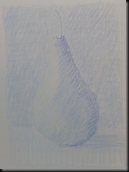
Coloured pencil is best work up in many progressive layers, using a constant pressure of application.  Since it is not an opaque medium, it is also better to work from progressively lighter to darker.  In order to get a smooth gradation of tones, I will apply the lighter tone first, then the darker tone over top.  When I want to get a subtle change in tones I will layer the coloured pencils very progressively, interweaving the tones.  Here is the pear drawing in its stages:
cp-02 cp-03
The lightest blue is used to block in the large shapes.  Attention is paid to the shape of light and shadow. The light shade of blue is applied in several layers before starting to add the darker blue coloured pencil.
cp-04 cp-06
The darker tone of blue of blue is used to strengthen the shadow on the pear, while the lighter tone is applied again in the background. The darker tone of blue is applied to the background.  The darker tone appears lighter because of the many layers of lighter tone beneath it.  The lighter tone of blue is also added to the area between the light and shadow of the pear.

cp-07 cp10
I repeat the layering of light and dark tones on the pear and background until the paper seems almost saturated with the coloured pencil. In the last stage I add the darkest blue into the shadow of the pear.  I also add several layers of the lighter tone of blue to soften the transition between light and shadow.


Soft Pastel:

Soft pastel is worked differently then coloured pencil because it is an opaque drawing medium.  This means that I can apply dark over light or light over dark in order to achieve different gradations of tone.  I am working with Prismacolor Nupastels using several tones of blue plus white. I am using Canson Mi Teintes paper in a creamy off-white. Here is the tonal scale:
sp-02
sp-04 sp-05
The drawing is blocked in with white.

The lights and shadows and blocked in with white and the lightest blue.
sp-06 sp-08
The light tone of blue is added to the background.  The middle tone of blue is added to the shadow side of the pear. The drawing becomes sharper by working the different areas of light and dark. Blending in the colour: This is an optional stage.  By finger blending the tones the colour of the paper is covered up.  I will generally do this only at the beginning of the drawing because over blending will make the colours dull and lifeless.
sp-09 sp10
I add white and the light tone of blue to the background and foreground using loose cross hatched strokes. I put more white over the blue in the foreground to make certain it is lighter.

I strengthen the shadow of the pear with the middle tone blue.  I continue to cross hatch the light blue and white in the background and foreground.
sp-12 Here is the finished pear drawing. Although I was using only three tones of blue plus white, I am able to get many different subtle tones of blue by applying multiple layers of colour.

Soft pastel is a unique drawing medium because I can create drawings that are graphic and painterly at the same time.  Because of its opacity, I can layer light of dark and dark over light to create different tones.